Understanding Icons: Their Importance and Variations
In the digitized landscape of design and communication, icons play a critical role. They serve as visual cues that enhance user experience by providing intuitive navigation and information dissemination. Icons are more than mere images; they encapsulate concepts and ideas, making them an integral component of modern design. This article dives deep into what icons are, their significance in various contexts, and best practices for effective usage across platforms.
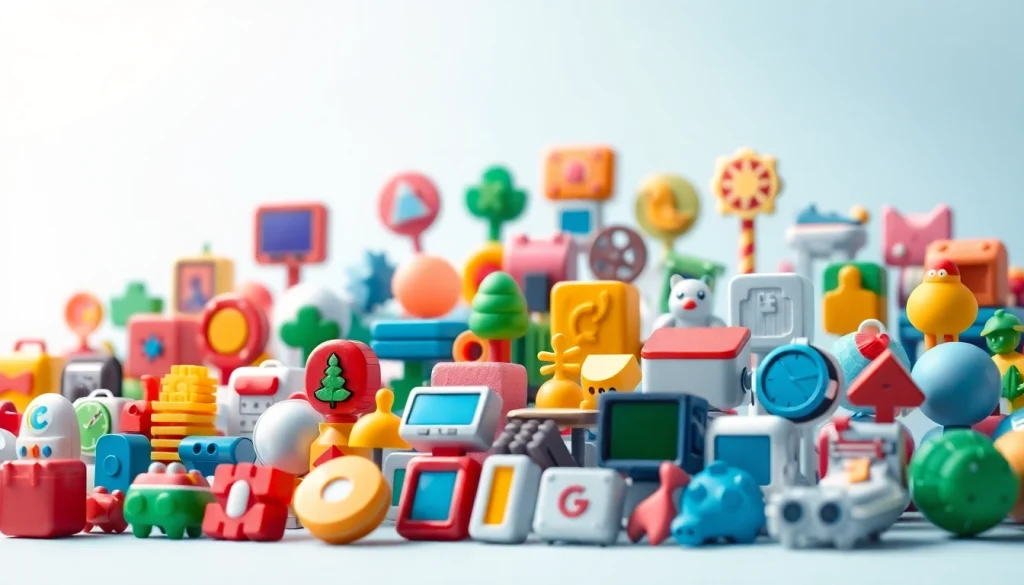
What are Icons? Definitions and Types
Icons can be defined as simplified graphical representations of objects, actions, or concepts. They are designed to convey meaning quickly and clearly, allowing users to navigate applications and websites intuitively. Icons come in various types, including:
- Universal Icons: These are symbols that transcend language barriers, such as the magnifying glass for search or the trash can symbol for deletion.
- Brand Icons: Unique logos that represent a company or product, such as the apple for Apple Inc. or the swoosh for Nike.
- Interface Icons: Used in software and web applications, these icons guide users through functions and features.
The Role of Icons in Design and Communication
The role of icons extends beyond mere decoration; they function as essential elements of user interface design, aiding in visual communication. Icons help to:
- Simplify Information: By condensing complex messages into simple images, icons improve understanding.
- Facilitate Navigation: Icons can indicate directions, actions, or categories, enabling users to navigate more easily.
- Enhance Aesthetic Appeal: Well-designed icons can elevate the overall visual quality of a project, making it more engaging and professional.
Common Icon Styles: Flat, Outline, and Three-Dimensional
Icon styles vary widely, each serving different purposes and design philosophies:
- Flat Icons: Characterized by minimalism and simplicity, flat icons have no three-dimensional effects or gradients. They are often favored for their clean look and ease of recognition.
- Outline Icons: These icons consist of only the outer lines of shapes, providing a lightweight aesthetic that integrates well with various design contexts.
- Three-Dimensional Icons: Utilizing shadowing and gradients, these icons create a sense of depth, making them appear more realistic and impactful.
Creating Effective Icons: Best Practices
Design Principles for Icon Creation
Creating effective icons requires adherence to certain design principles:
- Simplicity: Icons should be easily recognizable at a glance. Complex designs can confuse users.
- Consistency: Icons within the same application or website should maintain a coherent style and weight to unify the user experience.
- Scalability: Icons should be designed to look good at various sizes; they must remain recognizable whether displayed in a small toolbar or as part of a large infographic.
Choosing Colors and Shapes for Impact
The choice of color and shape affects the visibility and emotional response to icons. Here are some guidelines:
- Color Psychology: Different colors evoke different feelings and associations. For instance, blue often conveys trust, while red can signal urgency.
- Shape Recognition: Certain shapes have universal meanings—for example, circles can suggest continuity, while triangles may imply direction or action.
Testing Icons for Usability and Clarity
To ensure that icons are effective, testing is crucial. User testing can highlight areas of confusion and opportunities for improvement:
- A/B Testing: Compare different versions of an icon to gauge user preference and understanding.
- Feedback Collection: Gather user feedback through surveys to assess the clarity and effectiveness of icons in context.
Using Icons Across Different Platforms
Icons for Websites: Navigation and User Experience
On websites, icons are typically used to enhance navigation and improve user experience. Effective usage includes:
- Navigation Bars: Icons can replace text or complement it in navigation menus, allowing for cleaner interfaces.
- Call to Action (CTA): Incorporating icons in CTA buttons can draw attention and increase click-through rates.
Mobile Apps: Icons and User Engagement
Mobile applications heavily rely on icons due to the limited screen space. Here are ways to leverage icons effectively:
- Home Screens: App icons must be recognizable and visually distinct, as they represent the primary entry point for users.
- In-App Navigation: Icons should be used consistently throughout the app for navigation to ensure a seamless user experience.
Social Media Icons: Branding and Identity
Icons on social media platforms act as a means of branding and identity:
- Profile Icons: Users often choose icons that reflect their personality or brand’s values, aiding in personal branding.
- Share Icons: Consistent use of recognizable social media icons can encourage users to share content across platforms, boosting engagement.
Trends in Icon Design: What’s Next?
Emerging Styles and Techniques
The world of icon design is dynamic, with new styles and techniques frequently emerging. Some notable trends include:
- Neumorphism: Blending elements of flat design and skeuomorphism, neumorphism creates soft, inset styles that offer a tactile feel in digital interfaces.
- Minimalism: Continuing from previous years, the minimalistic approach focuses on stripping back unnecessary details for clarity.
Animated Icons: Engaging Users in New Ways
Animation is becoming increasingly prevalent in icon design:
- Microinteractions: Small animations can provide feedback to users, such as a loading spinner, making the experience more interactive.
- Dynamic Icons: Icons that change or animate based on user interaction can capture attention and facilitate engagement.
Custom Icons vs. Stock Icons: Making the Right Choice
When choosing icons for a project, designers must decide between custom icons and stock options:
- Custom Icons: Tailored to specific brand needs, these icons can enhance branding but may incur higher costs and time investments.
- Stock Icons: While cheaper and quicker to obtain, stock icons might lack uniqueness and could lead to brand dilution if widely used across the web.
Conclusion: The Future of Icons in Digital Communication
Icon Accessibility: Meeting Diverse User Needs
As the digital landscape evolves, ensuring accessibility becomes paramount. This includes designing icons that cater to users with varying abilities:
- Color Contrast: Icons must have sufficient contrast to be discernible to users with visual impairments.
- Alt Text: Providing textual descriptions for icons enhances accessibility for screen reader users.
Integrating Icons in Transforming User Interfaces
As user interfaces become increasingly complex, the integration of icons will play a critical role in guiding users through their experiences. The effective use of icons in conjunction with other UI elements can lead to a more engaging and intuitive interaction.
The Power of Icons in Branding and Marketing
Finally, the power of icons in branding and marketing cannot be overstated. Icons serve as a quick, visual shorthand for brands, conveying messages far more efficiently than text alone. A well-designed icon can create a lasting impression on users, fostering brand recognition and loyalty.